The Timeless Appeal of the Pringles Logo
Is there anyone who doesn’t enjoy the sensation of reaching into that iconic Pringles container? There’s something incredibly satisfying about sliding your hand inside and savoring a crispy, curved chip with your eyes closed. Whether it’s Cheddar Cheese, Sour Cream & Onion, or Wendy’s Spicy Chicken Sandwich, “once you pop, the fun don’t stop.”
From its packaging to its logo, everything about Pringles exudes a certain magic. Have you ever wondered who the man with the mustache in the Pringles emblem is?
That man, with his bushy mustache and neatly parted hair, is none other than Mr. Julius Pringle. This friendly figure, who always beckons you to dip into the can, is one of the most recognized brand mascots in the world. We’ll delve into his story and the evolution of the Pringles logo, but first, let’s explore the brand’s origins.
A Brief History of Pringles
In 1965, chemist Fredric J. Baur began designing saddle-shaped chips. While Baur successfully created the distinctive shape, he struggled with making them palatable. Nevertheless, he is credited with choosing the tubular can that has become synonymous with Pringles.
Another Procter & Gamble researcher, Alexander Liepa, improved the chip’s taste. Although Baur developed the product, the patent bears Alexander’s name.
Pringles hit the market in 1968 in Indiana, and soon, it was available nationwide. By 1991, Pringles was distributed and marketed internationally. Catchy slogans like “Once you pop, the fun don’t stop” and “Once you pop, you can’t stop” became as iconic as the product itself.
Pringles Logo Meaning
The Pringles logo features Mr. Julius Pringle’s head above the wordmark. The identity of Mr. Pringles has been the subject of much debate. Though his origins are somewhat mysterious, several key figures contributed to his creation.
Besides Baur and Liepa, Gene Wolfe, a science fiction writer and mechanical engineer, played a role in building the machine that cooked the chips. However, Mr. Pringle’s exact identity remains a mystery.
Pringles Logo History
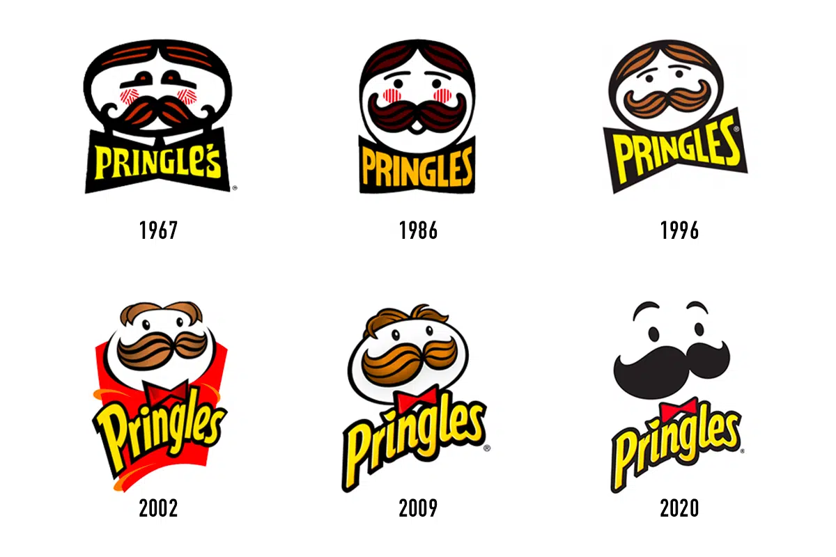
Since its inception, Pringles’ visual identity has undergone several modifications:
1967 – 1986: The original logo featured a man’s face with black and red hair, a heavy mustache, and red and white striped cheeks. The yellow and black wordmark sat beneath his head. Mr. Julius Pringle quickly became an iconic mascot.
1986 – 1996: In 1986, the brand name changed from “Pringle’s” to “Pringles.” Mr. Pringles received a makeover: his face and eyes became circular, and his mustache was rounded. The new sans serif typeface for the wordmark added a fun vibe.
1996 – 2002: Nearly a decade later, the logo was positioned diagonally with a brighter color palette. Mr. Pringles lost his patterned cheeks and his bright red color was replaced with earthy brown. The wordmark became cleaner and more energetic.
2002 – 2009: In 2002, the logo took on a fancier appearance. Mr. Pringles’ hair and mustache became light brown, and he lost his eyebrows. A red bow tie added a fun, contemporary touch.
2009 – 2021: The 2009 version featured a white background, a white-bordered wordmark, and a lighter red bow tie. This redesign was fresh and retained its youthful energy.
2021: The latest logo, designed by Jones Knowles Ritchie, presents Mr. Pringles with a bald head, beadier eyes, and more expressive eyebrows. The new look aims to simplify and modernize the design, highlighting the stackability of the crisps.
Pringles Logo Font
The font used in the Pringles logo closely resembles Bodega Sans Medium, a geometric sans serif typeface designed by Greg Thompson and published by the Font Bureau.
Relevance
A great logo communicates the brand’s personality and remains relevant to its market. Mr. Pringles exemplifies the brand’s identity and appeals to its target audience.
Memorability
A memorable logo is unique and easily recognizable. The Pringles logo, with its distinctive Mr. P, stands out and ensures the brand is remembered.
Simplicity
Simple logos, like those of IBM and McDonald’s, are easily recognized and convey the brand’s essence quickly. Mr. Pringles is a simple yet powerful mascot that embodies the brand’s playful spirit.
Timelessness
Timeless logos, like those of Gucci, Coca-Cola, and Apple, avoid fleeting trends and focus on authenticity. The Pringles logo, with Mr. Pringles as its timeless element, has remained consistent since 1967.
In Conclusion
Mr. Julius Pringle has been tempting snack lovers since 1967. Despite his latest bald look sparking mixed reactions on social media, he remains youthful and charming. The Pringles logo, like the crisps, is here to stay, blending all the essential design elements into a harmonious whole.


